selam berhea
selam.work@proton.me
ZB Trucking
Overview
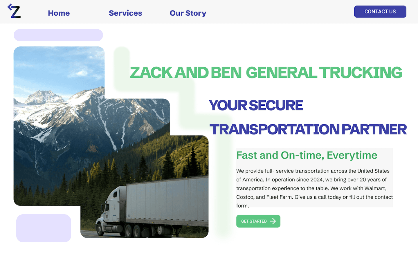
Zack and Ben Trucking is a small, family-owned transportation company that needed a clean and professional web presence. I started the project by surveying existing transportation websites and building a mood board around color palette options.
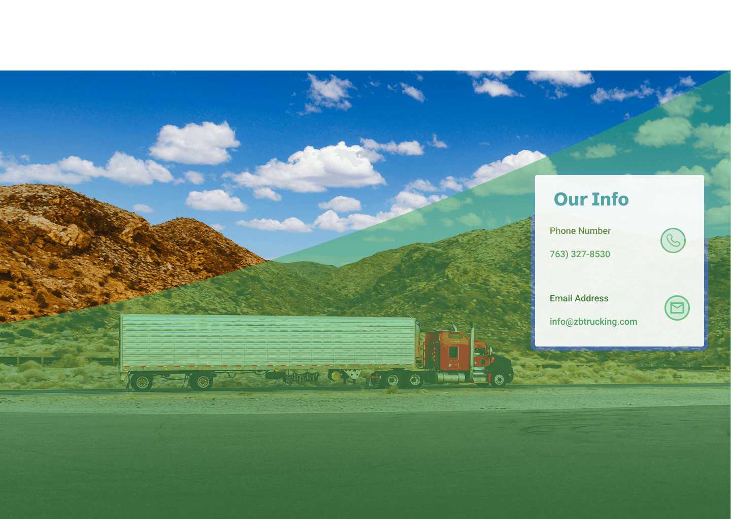
Many companies in the space leaned into bold, masculine palettes — black and yellow, navy, red and white. I wanted something that felt quick, friendly, and reliable. I landed on a light, bright combination and wove a trail/road motif throughout the pages to reinforce the brand's identity.
Role
UX/UI Designer
Brand Strategy, Visual Design, User Research, Prototyping
Problem Statement
ZB Trucking is a small family-owned transportation company. They needed a website that communicates their service offerings and establishes legitimacy with potential partners. The site needed to serve two very different audiences: owner-operators looking for work and carriers who need reliable transport, while also making a strong first impression on casual browsers.
User Personas
Through initial conversations with the client, we identified three core user types for the site. We prioritized the first two since their needs were most pressing and most directly tied to the business's growth.
Owner-Operator
Drivers who own their own trucks and are looking for a reliable broker to partner with. They need clear information about pay, routes, and how to get started.
Carrier
Businesses or individuals who need freight moved. They want to know the company is trustworthy, insured, and responsive.
Casual Browser
Someone who lands on the site without a specific intent. The site should still communicate brand quality and leave a positive impression.
Defining the MVP
With a small budget and timeline, scoping the MVP was critical. I worked with the client to identify the pages and features that would deliver the most value immediately.
Homepage. A strong first impression with a clear value proposition and calls-to-action for both owner-operators and carriers.
Services Pages. Separate pages tailored to each user persona, answering their top questions and reducing friction to contact.
Contact Form. A simple, accessible form that routes inquiries to the right person on the team.
Brand Identity. A cohesive color palette, typography system, and road/trail motif applied consistently across all pages.
Designs
I ran through several rounds of iteration, testing color combinations and layouts before landing on the final direction. The goal was a site that felt professional and trustworthy without being cold. Tone goals = friendly, energetic, and professional.
Homepage
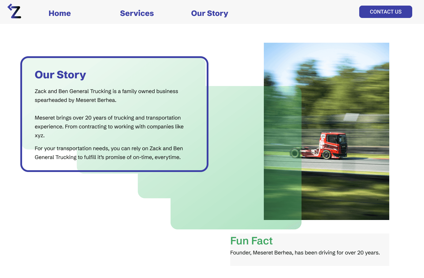
About Page
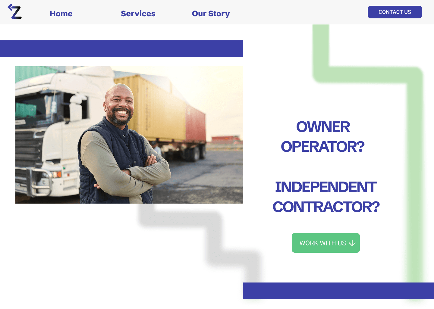
Careers Page
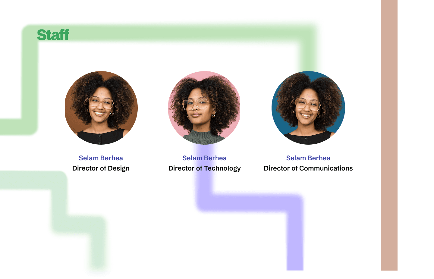
Staff Page
Contact Page
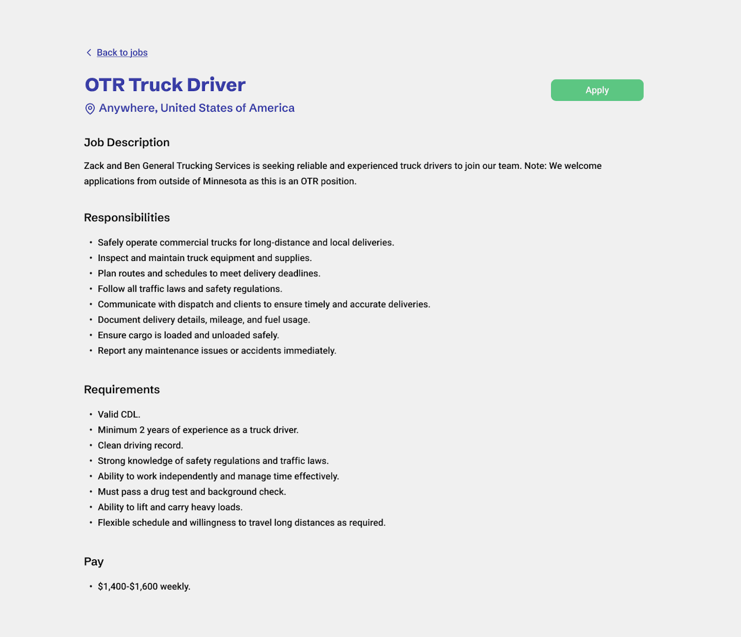
Job Posting Page
Results & Takeaways
For this project I wore the hat of brand strategist, researcher, and visual designer. A few key learnings shaped how I'll approach similar projects in the future.
Know your audience deeply. Owner-operators and carriers have very different mental models. It was important to separate flows for usability.
Brand consistency compounds. Repeating the road motif and color palette in small, unexpected places (section dividers, button hover states) strengthened.
Scope aggressively, launch fast. For a small business, getting something live quickly is more valuable than a perfect design.